Wine Tasting Colour Map Studio Story
Enter your email address to be notified when this item is back in stock

Wolf & Badger
Wine Tasting Colour Map Studio Story
Out of Stock
Price History
Description
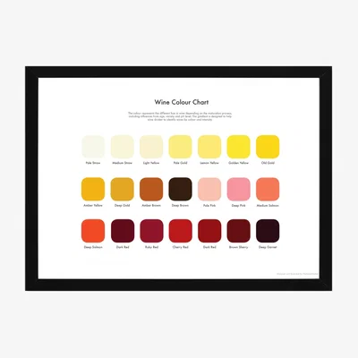
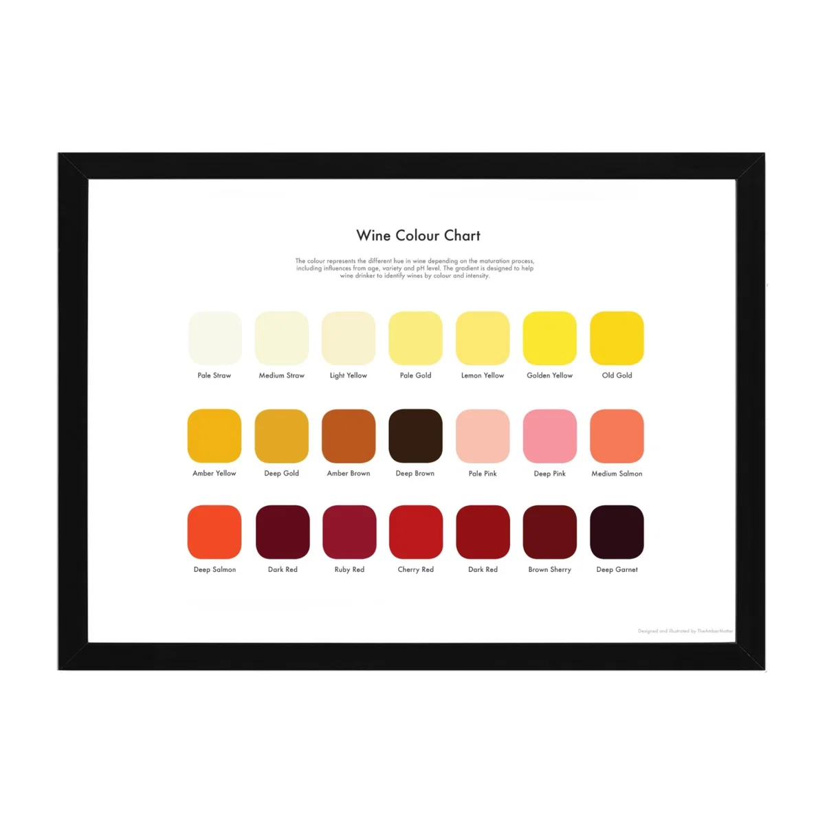
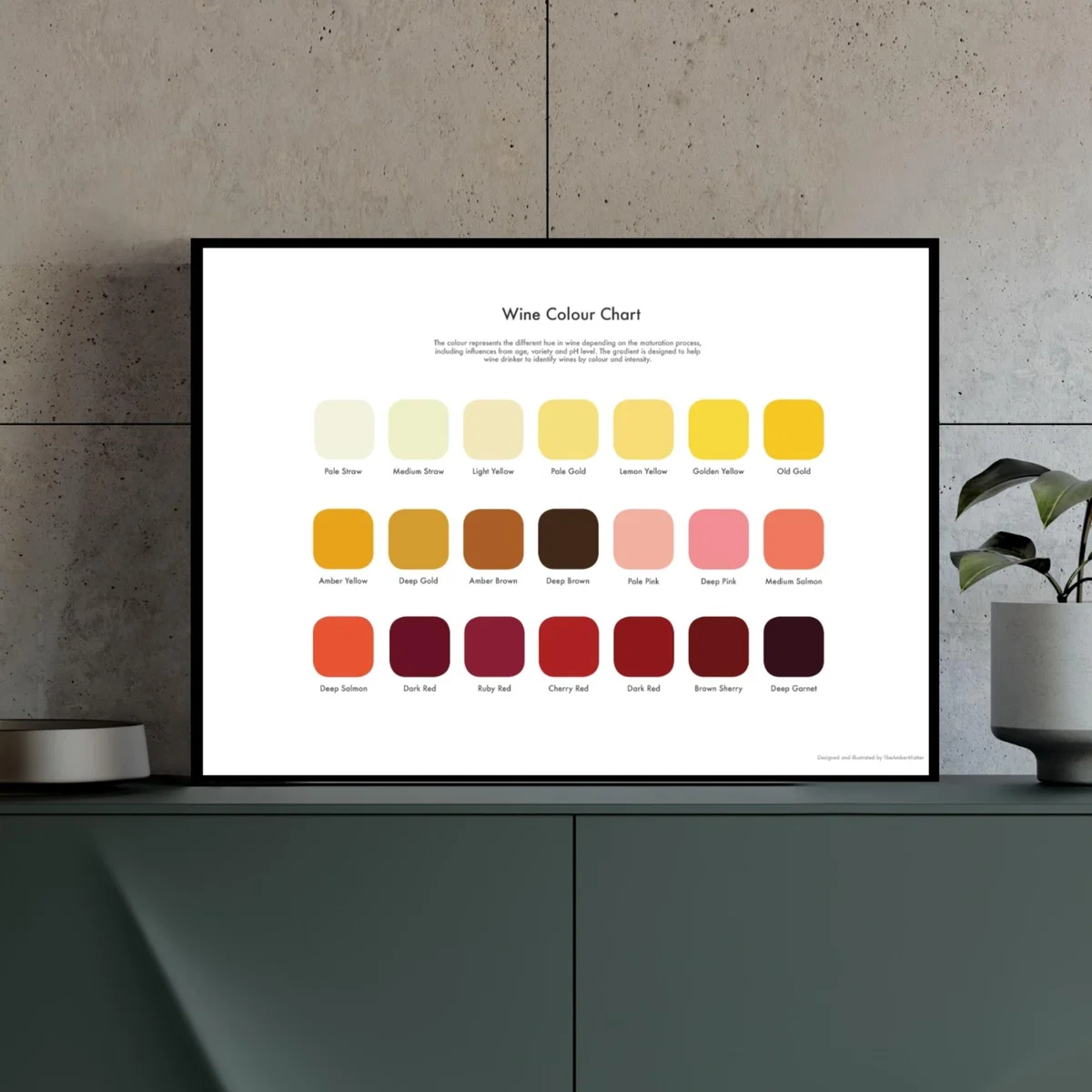
The colour illustrates different shades of hue for wine depending on the maturation process, including age, variety and p. H level. The gradient is designed to help every wine enthusiast identify the colours and intensity of their drink. A classy touch to your home. Signed and printed on 180gsm fine art paper, sold unframed. Design and professional printed in London. Ship flat, package with a clear archival sleeve and sturdy backing mountboard for a beautiful presentation.
Our Stylist Says
I love this wine tasting colour map for its clean, organised aesthetic and the way it can bring a fresh, sophisticated vibe to a space. It works well in modern or minimal interiors, especially bedrooms, living rooms or kitchens where colour coordination is key. Practical styling tips include pairing it with neutral furnishings to let the colours really stand out, or using it as a colour reference to guide accessory choices like cushions, vase hues or artwork accents. Its vibrant palette can also spark creativity in a home office or craft room. Framing it simply keeps the focus on the colours and adds a polished finishing touch, making it not just a functional reference but an engaging visual element.
Adrian Wells
Flitch Interior Stylist
Dimensions
Dimensions can be found on Wolf & Badger's website here
About Wolf & Badger
Global Reach and Ethical Focus
Since its inception with a boutique in Notting Hill, Wolf & Badger has expanded to a significant online presence and flagship stores in London's King's Cross, New York, and Los Angeles. This growth mirrors their vision of building a community of ethical brands and conscious consumers.
Award-Winning Sustainable Practices
In 2021, Wolf & Badger's efforts in sustainable retailing were recognized with awards like Drapers Sustainable Retailer of the Year and Marie Claire's Best Ethical Retailer. Their commitment to making business a force for good is further solidified by becoming the first B Corp certified marketplace in the UK.